Victory Church
A church website built to make the first visit feel easy
A custom website and brand system for a non-denominational church in Raleigh, designed to help first-time guests know exactly what to expect and take a confident next step.
- Victory Church
- 2026
- web design, web development, graphic design branding, photography
Introduction
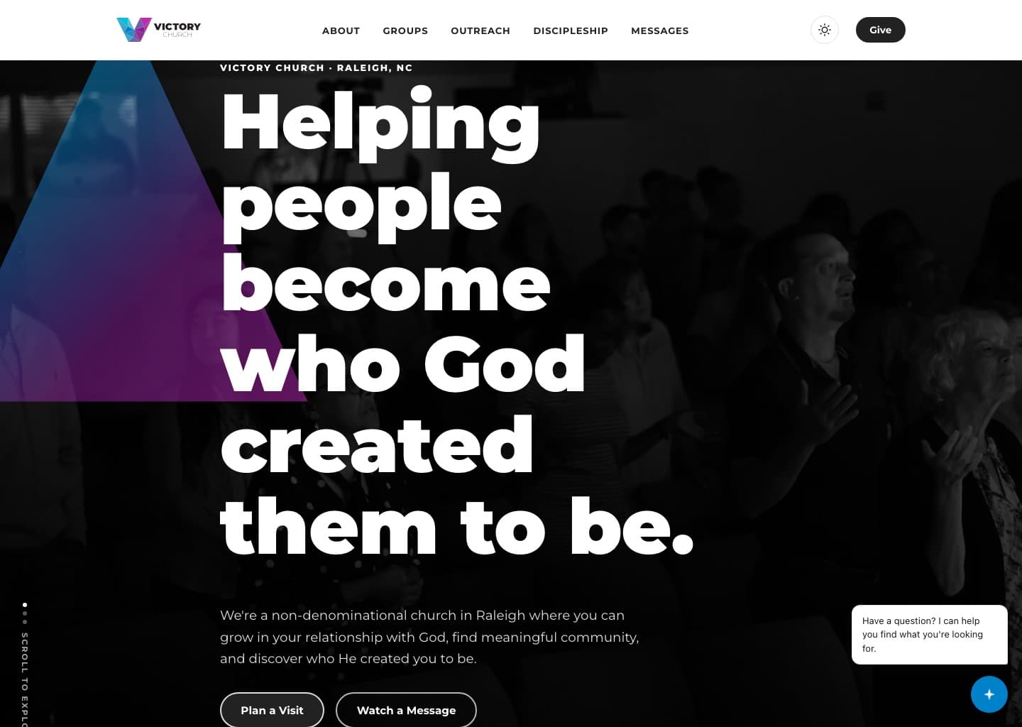
Victory Church is a growing non-denominational church in Raleigh, North Carolina. They needed a website that could do what a good church foyer does — welcome people who’ve never visited, answer the questions running through their heads, and point them toward one clear next step.
Client Context
A non-denominational church in south Raleigh with Sunday and midweek gatherings, a kids ministry, live-streamed services, and a steady stream of first-time guests who find the church online long before they walk through the doors. It’s also where my own creative career in church communications started — so this one is personal.
The Challenge
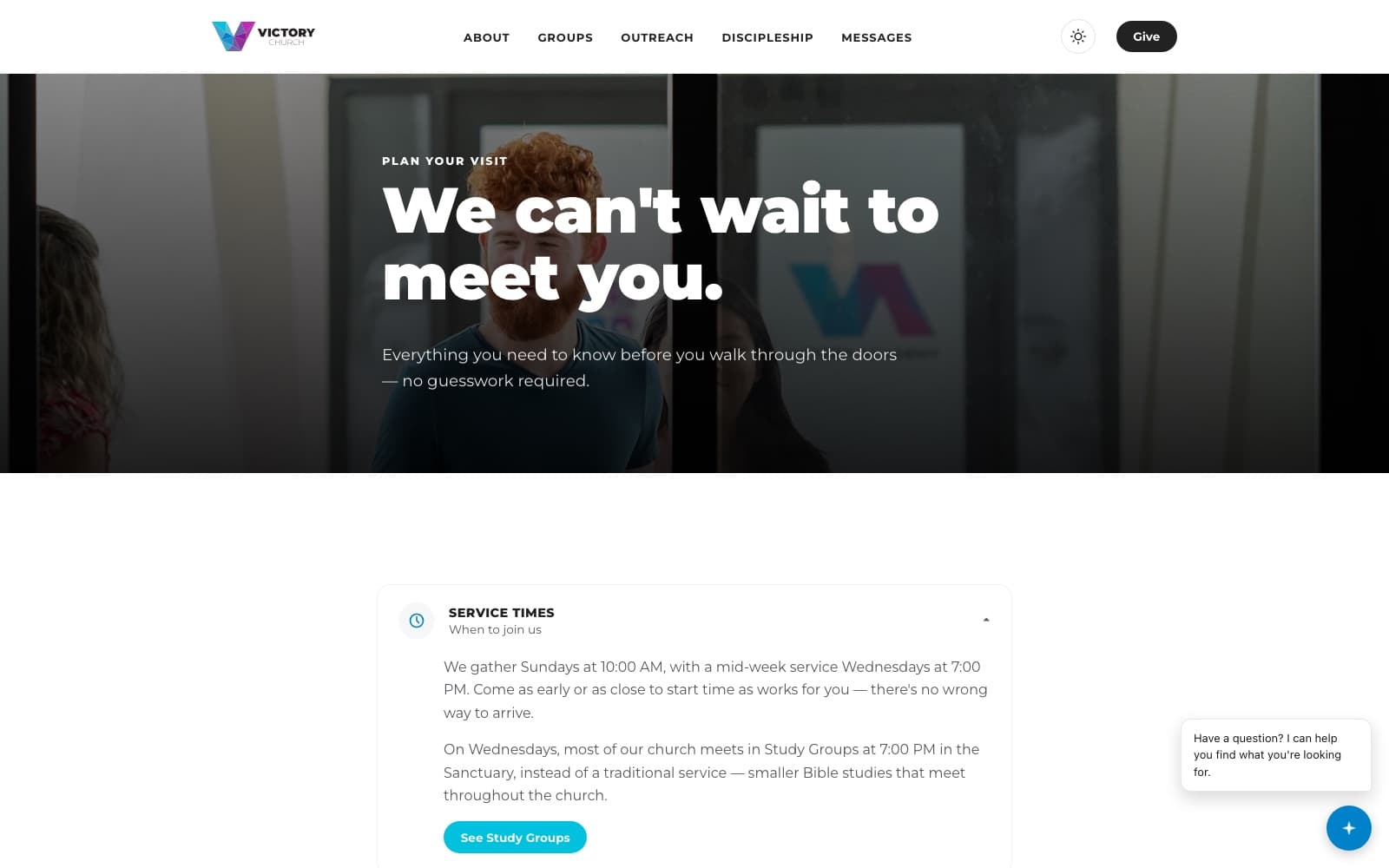
Most church websites go one of two ways: they bury a newcomer in insider language and endless menus, or they feel like a dated template that doesn’t match the warmth of the room. Victory needed a site that answered a first-time visitor’s real questions — where do I go, where do my kids check in, what should I wear, what actually happens on a Sunday — while still serving the whole congregation with messages, giving, events, and groups.
Strategic Approach
I built the experience around the first-time guest. The homepage leads with the practical things a newcomer needs — service times, address, what to expect, and kids check-in — and every section funnels toward a single, low-pressure next step: plan a visit. Deeper needs like messages, giving, groups, and discipleship stay a tap away without crowding the front door.
Creative Direction
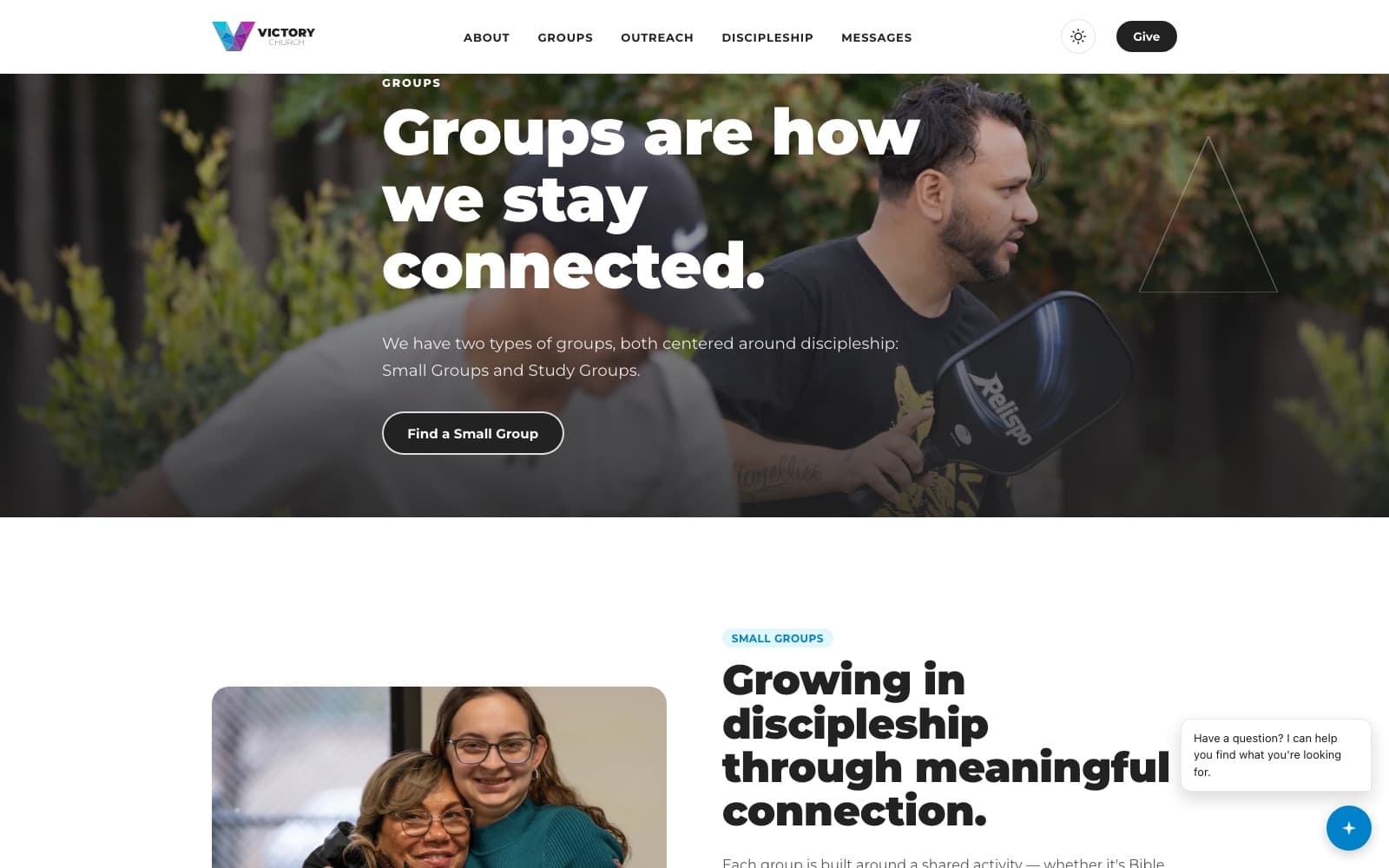
Warm but modern and editorial — real photography of the congregation, generous space, and confident typography, with a built-in dark and light theme so the site feels at home any time of day. The tone is invitational rather than promotional: “come as you are,” not “don’t miss out.”
Design System
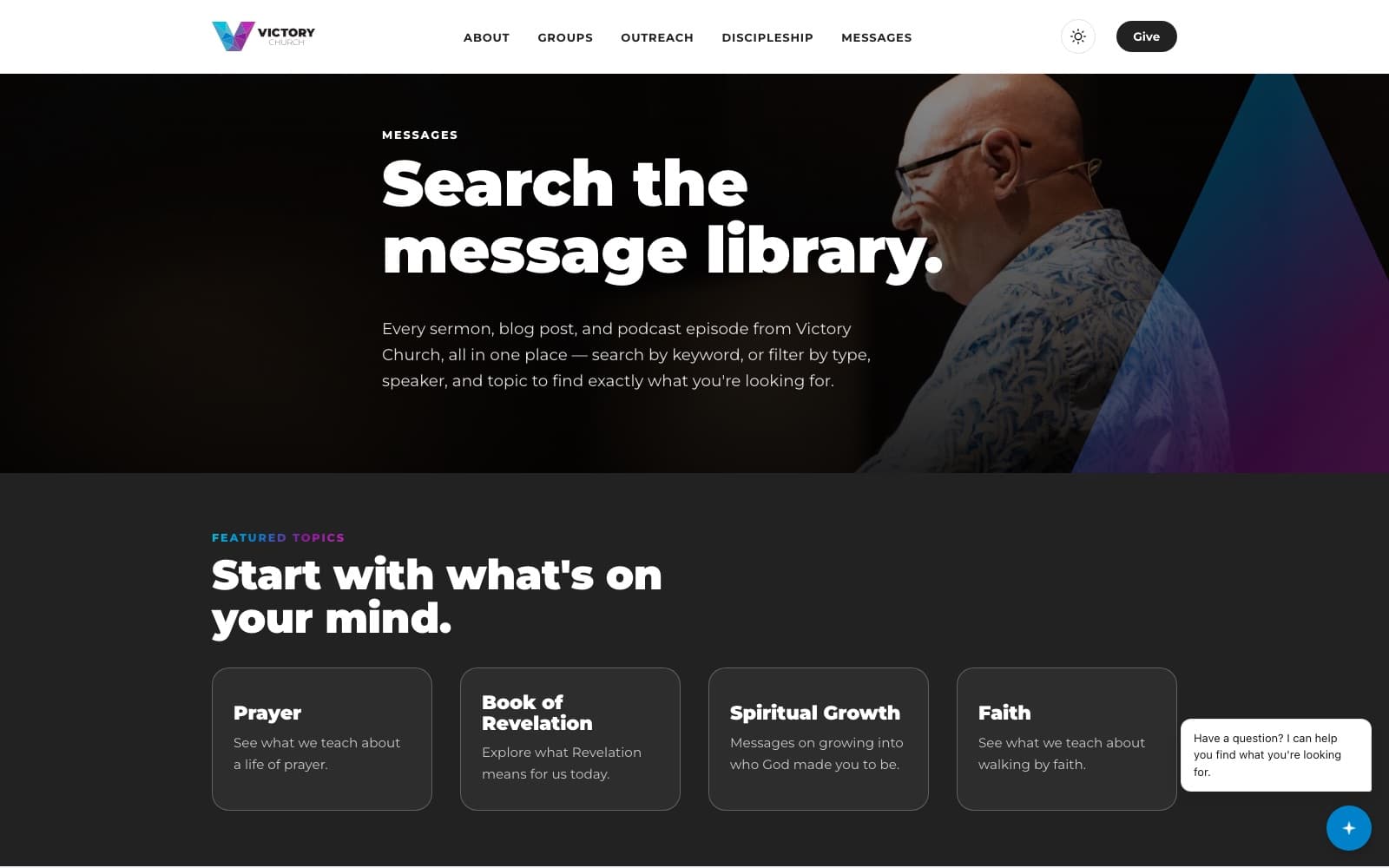
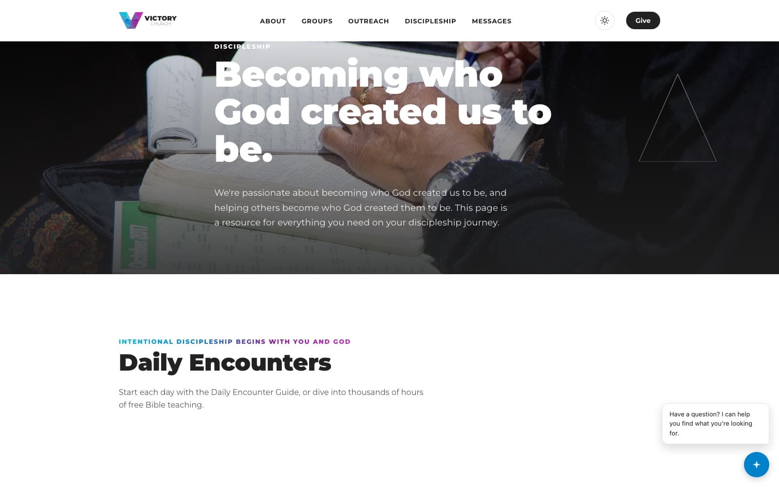
A flexible component system — hero, next-step cards, ministry blocks, message and event layouts, and a full footer sitemap — so the team can keep the site current as series and ministries change, without the design drifting over time.
Development Solution
A fast, responsive custom build with the pieces a modern church actually uses: live-stream and on-demand messages, online giving, events, groups and a discipleship pathway, a Victory Kids section, app promotion, and an AI-powered assistant that helps visitors find what they’re looking for — all with light and dark modes built in.
Photography & Film
Photography of Victory’s gatherings, shot and used across the site so the invitation feels real rather than stock.
Responsive Experience
Designed mobile-first, because most people meet a church on their phone before they meet it in person — so plan-a-visit, service times, and directions are immediate on a small screen.
A closer look
Ruach Platform
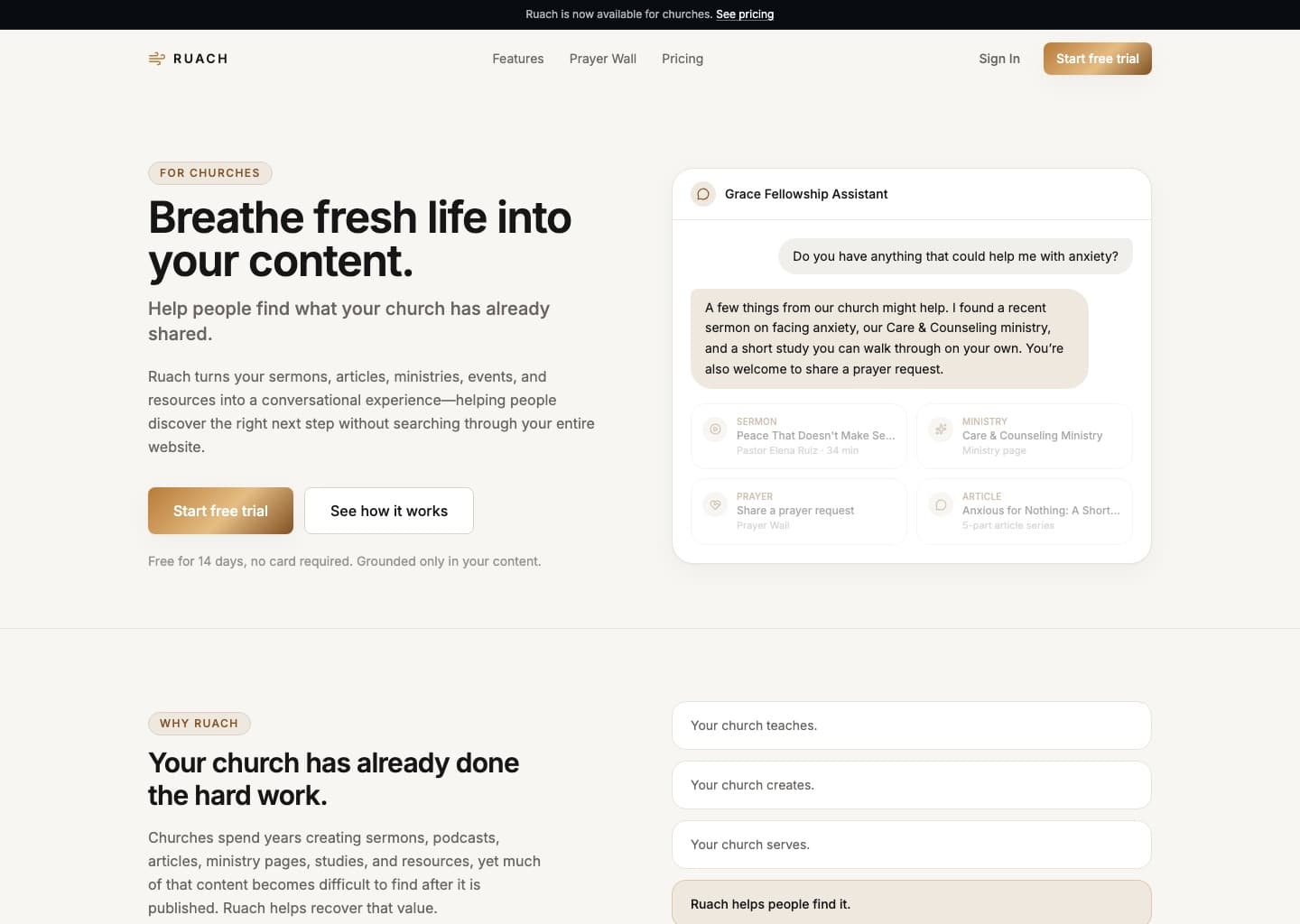
A conversational AI product I conceived, designed, branded, and built end to end — it turns a church’s existing sermons, articles, and ministries into a guided experience, so people find the right next step by asking, not searching.