A church website built to make the first visit feel easy
A custom website and brand identity for a non-denominational church in Raleigh: I helped develop the logo, colors and brand, then designed and built a site that helps first-time guests know exactly what to expect.
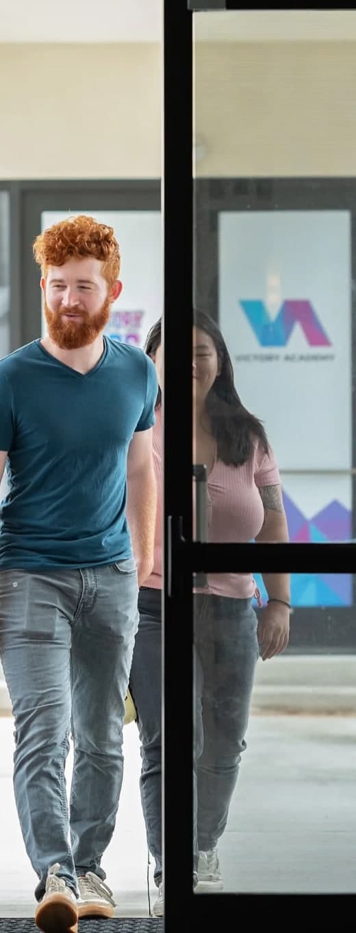
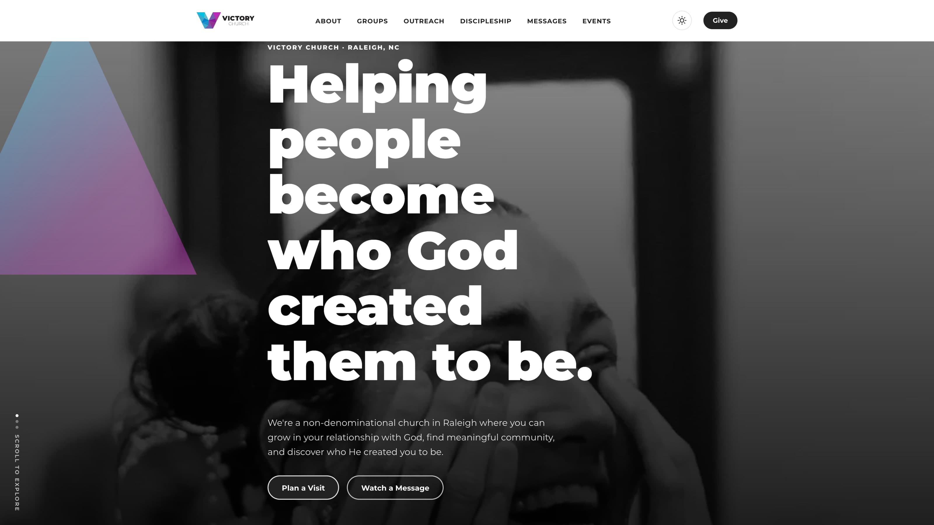
Most people meet a church on their phone long before they walk through its doors.
Where it starts
A non-denominational church in south Raleigh with Sunday and midweek gatherings, a kids ministry, live-streamed services, and a steady stream of first-time guests who find the church online long before they walk through the doors. It’s also where my own creative career in church communications started — so this one is personal.
My own career in church communications started here.
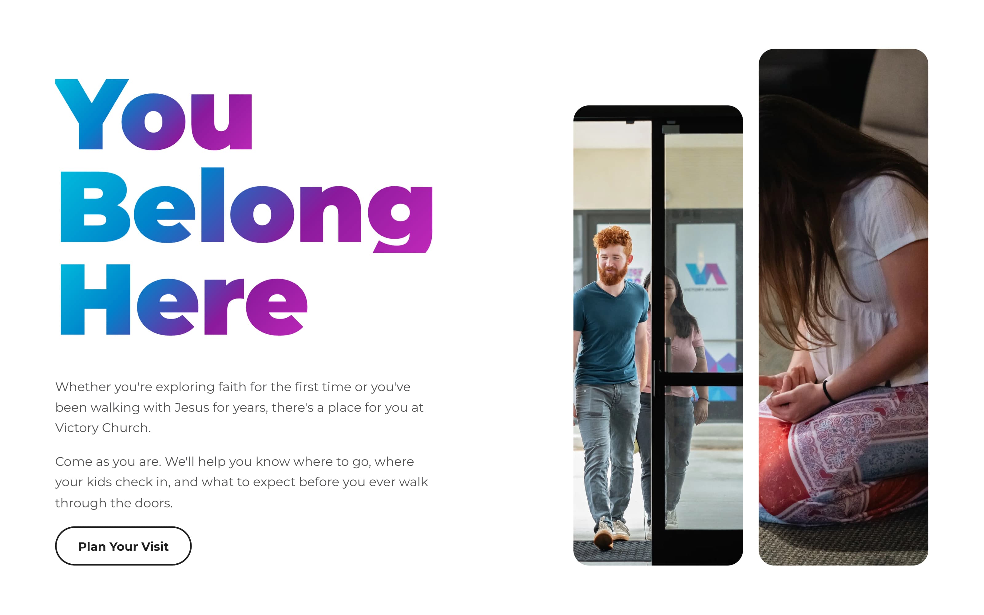
“You Belong Here.” The welcome, before the calendar.
The trouble with church websites
Most church websites go one of two ways: they bury a newcomer in insider language and endless menus, or they feel like a dated template that doesn’t match the warmth of the room. Victory needed a site that answered a first-time visitor’s real questions — where do I go, where do my kids check in, what should I wear, what actually happens on a Sunday — while still serving the whole congregation with messages, giving, events, and groups.

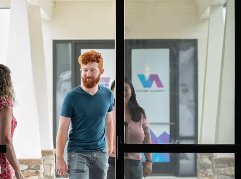
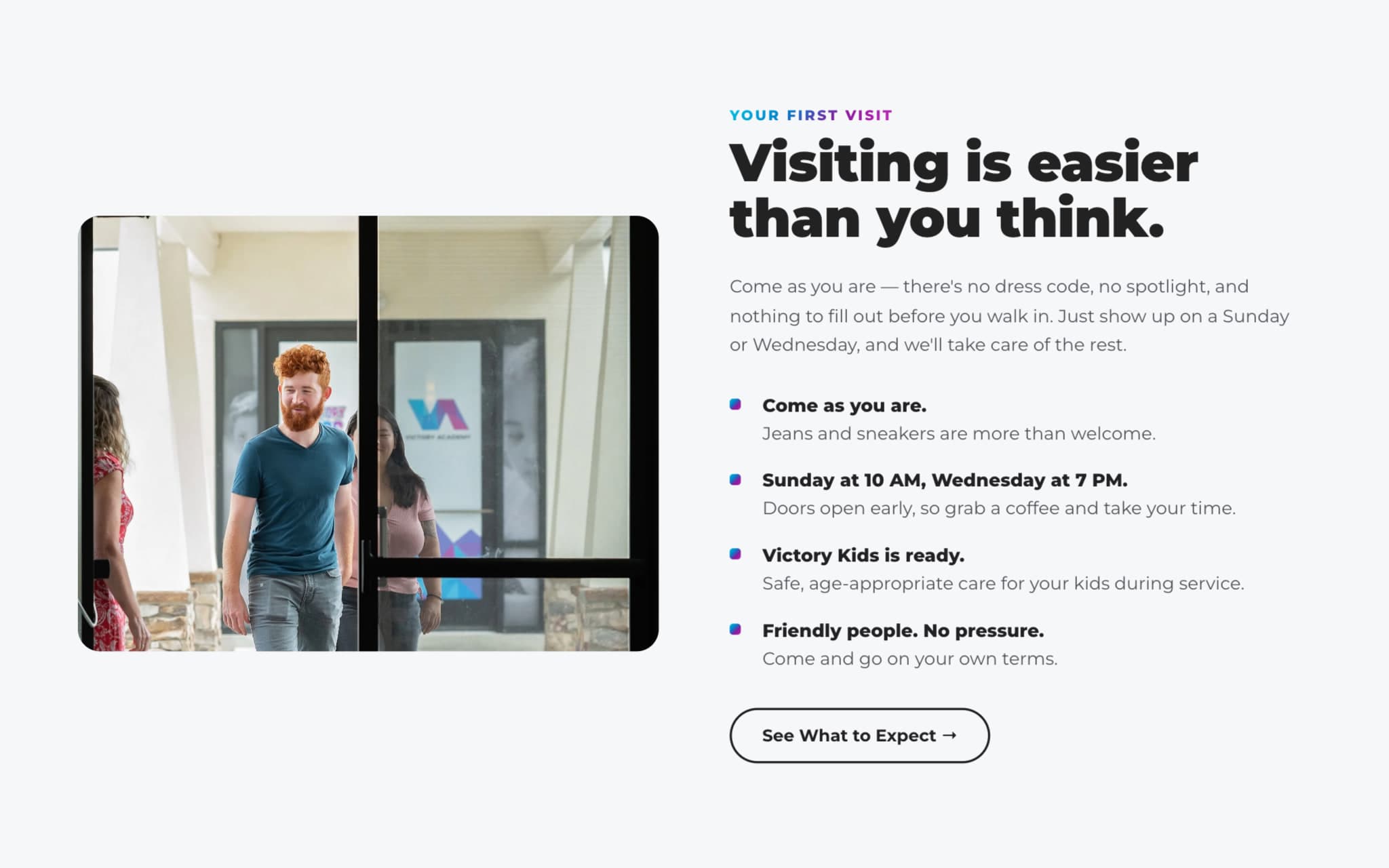
Built around the first visit
I built the experience around the first-time guest. The homepage leads with the practical things a newcomer needs — service times, address, what to expect, and kids check-in — and every section funnels toward a single, low-pressure next step: plan a visit. Deeper needs like messages, giving, groups, and discipleship stay a tap away without crowding the front door.
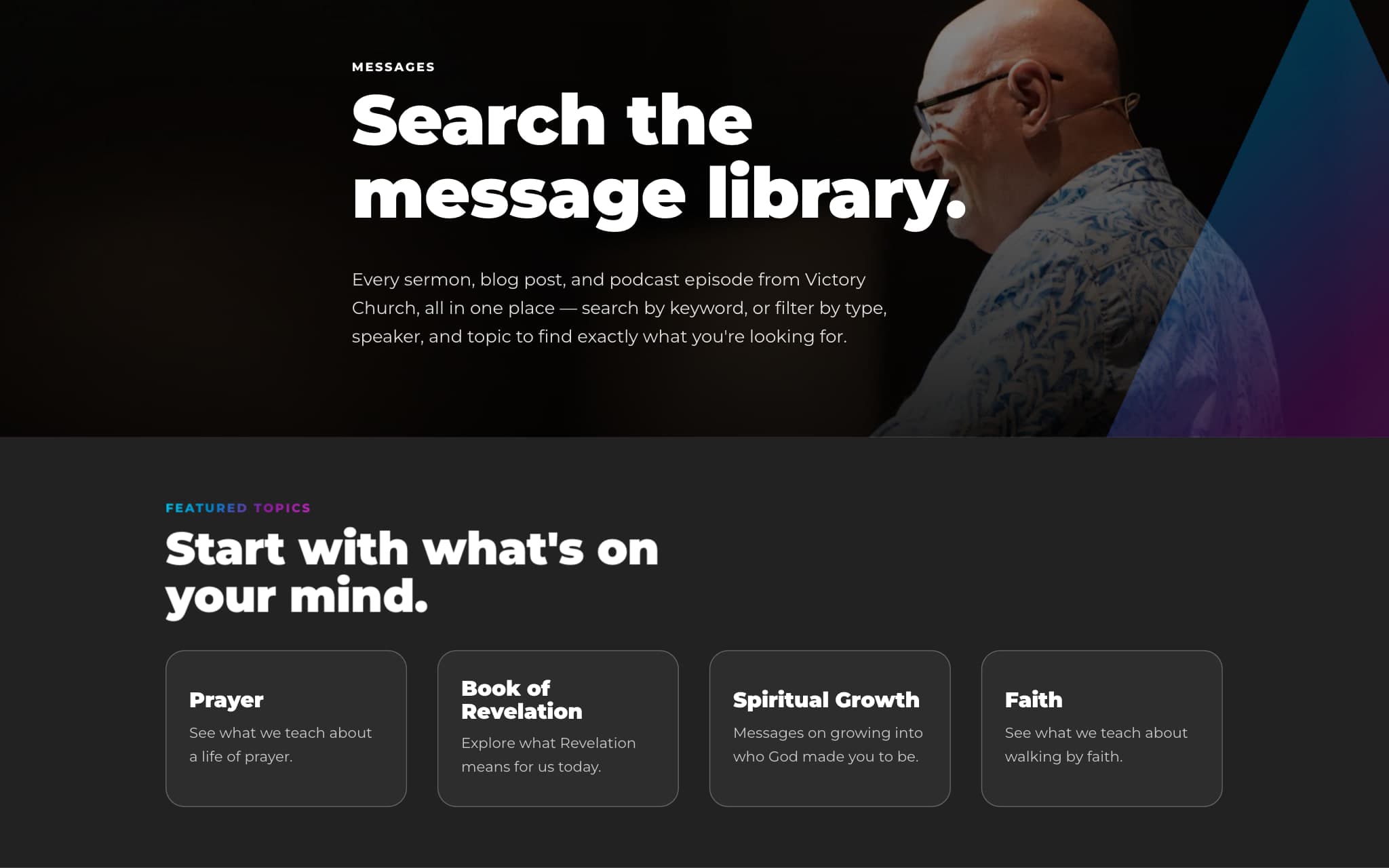
Search firstEvery sermon, blog post and podcast episode in one place, searchable by keyword and filterable by type, speaker and topic.
Topics as a way in“Start with what’s on your mind.” Featured topics give someone who doesn’t know what to search for a place to begin.
The brand behind the site
The website is only one part of Victory’s identity. I also helped develop the brand it’s built on: the logo, the color palette and the visual identity that the site draws from.
Logo, colors and brand identity.
Color
The palette I helped develop, sampled from the live site. The gradient lives in display type; everything else stays black and white so the photography carries the warmth.
- Cyan#03a9d7
- Blue#1075c5
- Indigo#4c4ab1
- Violet#6f2ea5
- Magenta#aa24ad
Tone
Warm but modern and editorial — the church’s own photography of its congregation, generous space, and confident typography, with a built-in dark and light theme so the site feels at home any time of day. The tone is invitational rather than promotional: “come as you are,” not “don’t miss out.”
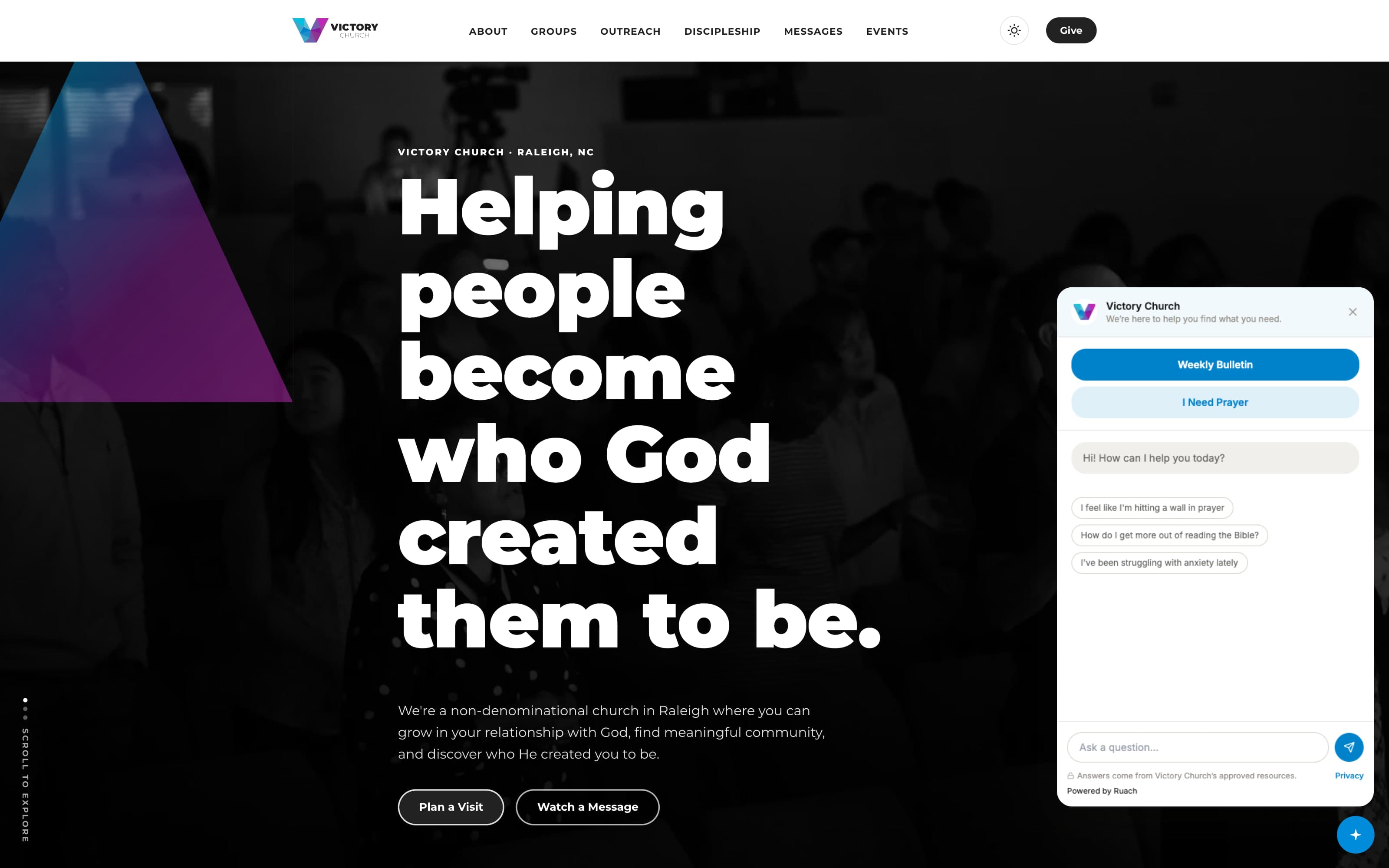
Ruach, the assistant I built as its own product, answering from Victory’s own messages and ministries.
What changed
- A first-time guest finds service times, the address, what to expect and kids check-in without leaving the homepage.
- Messages are searchable and browsable by topic instead of sitting in a date-ordered archive.
- Visitors can ask a question in their own words and get pointed to Victory’s own messages and next steps.
- Series and ministries change through reusable blocks, so the site stays current without the design drifting.
- Victory Church
- 2026
- Website and brand identity
- Helped develop the logo, colors and identity
- Raleigh, NC
- Ruach, the site’s assistant
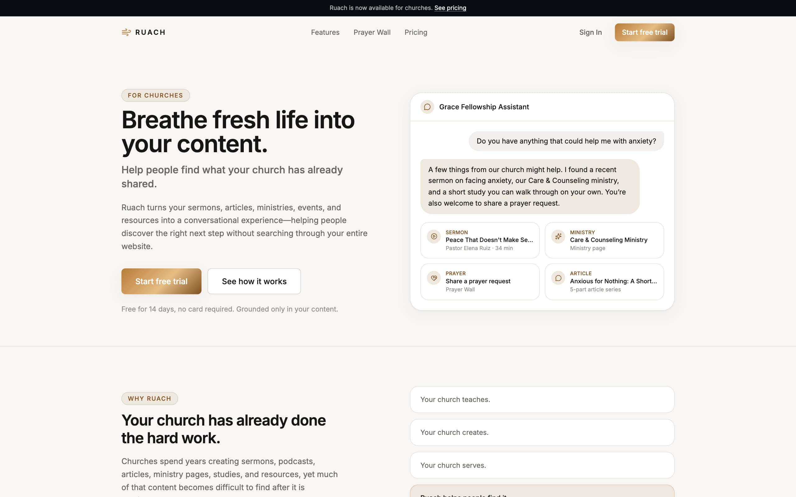
Ruach Platform
A conversational AI product I conceived, designed, branded, and built end to end — it turns a church’s existing sermons, articles, and ministries into a guided experience, so people find the right next step by asking, not searching.