Handled
An iOS app that quietly runs the household
A native iOS app I designed and built from the ground up — it learns a household, generates a fair chore schedule, adapts as life changes, and makes the whole thing feel warm instead of administrative.
- Handled
- 2026
- web design, web applications, graphic design branding
Introduction
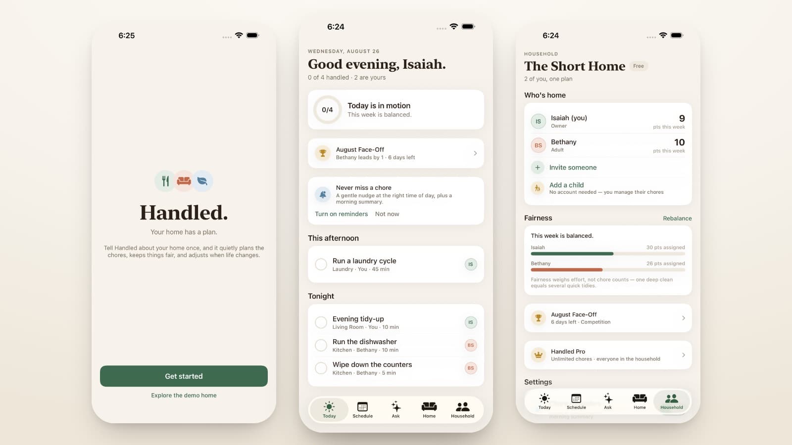
Running a home is a full-time job nobody actually holds — the quiet mental load of who does what, when, and whether it’s fair. Handled is a native iOS app I designed and built to hold that job: it learns your household, builds a fair chore schedule, and adapts when life changes — all in a way that feels warm rather than administrative. Its whole premise fits on a line: your home has a plan.
Client Context
Like the best product ideas, this one is personal. Handled isn’t client work — it’s my own product, conceived and built end to end, from the concept and design system through the architecture and the engineering.
The Challenge
Chore apps usually fail one of two ways: they’re cold checklists that feel like a manager handing out tasks, or they’re so fiddly that keeping them current becomes its own chore. The real problem underneath is fairness — the felt sense that the load is actually shared — and fairness is surprisingly hard to compute and even harder to make feel human.
Strategic Approach
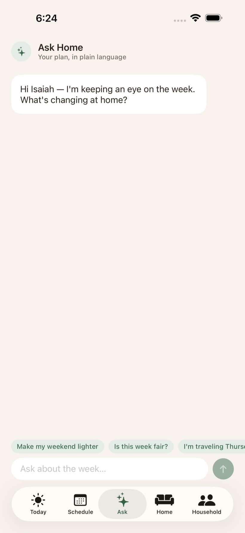
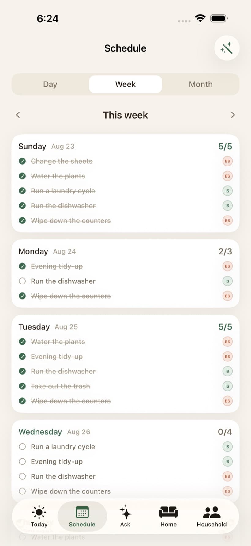
Treat the home like a system with a plan. A fairness engine accounts for real effort and proposes rebalances; a scheduling engine turns recurring chores into a concrete week that adapts when things slip (a guilt-free “catching up,” never a wall of red). Notifications run on a strict anti-nag ceiling. And an AI layer — “Ask Home” — lets anyone ask the household a question in plain language and get a grounded answer.
Creative Direction
Warm, calm, and specifically human. Linen surfaces, a deep fern-green brand color, member tints in clay and honey, serif display type for the human moments (“Good evening, Isaiah”) and rounded numerals for the stats. Copy is calm and concrete — “Tonight · Isaiah,” never system-speak. Dark mode is a first-class design, not an inversion.
Design System
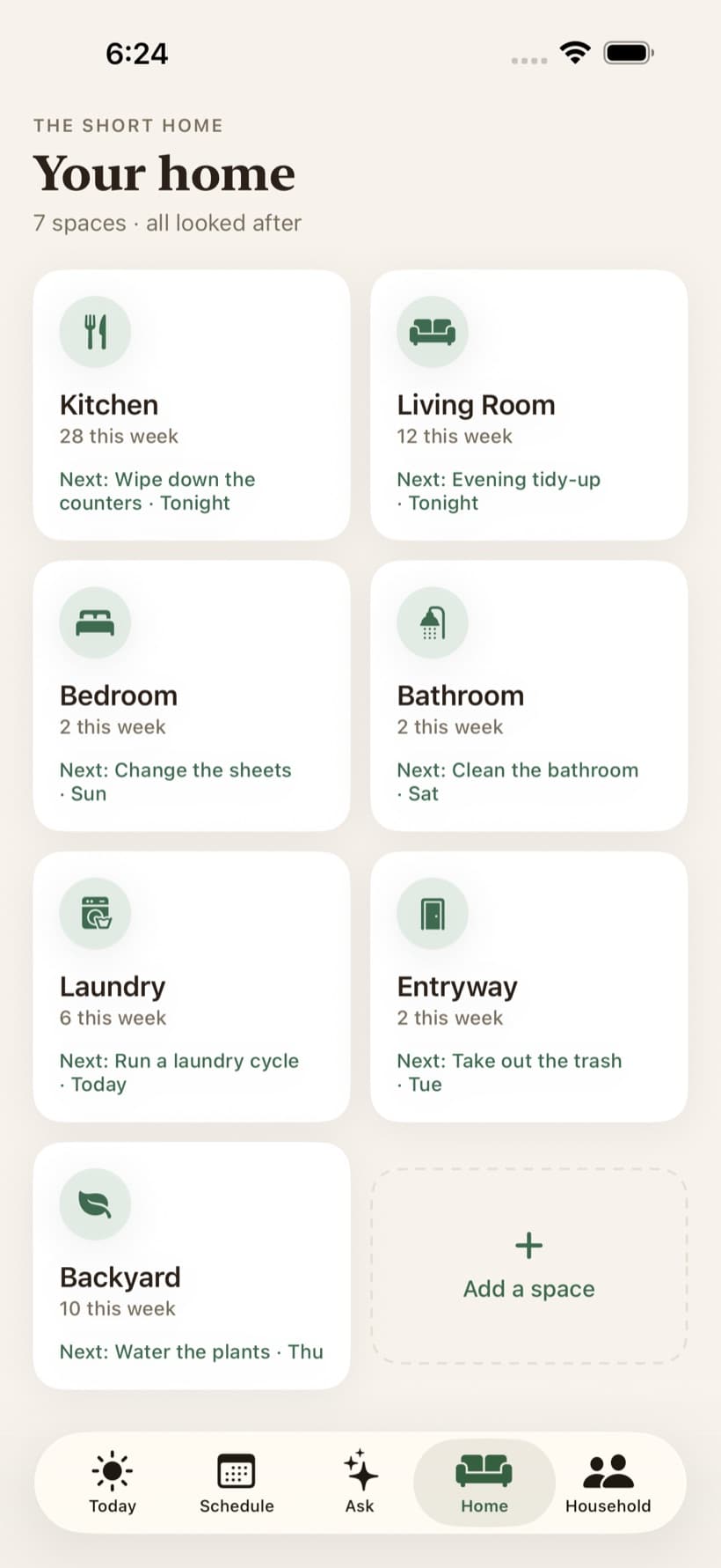
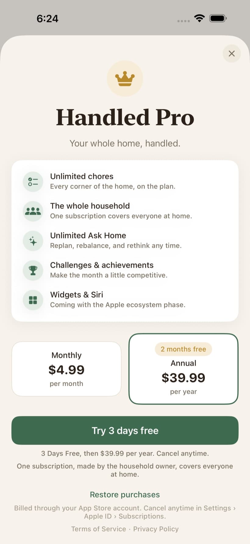
A full iOS design system — color, type, and spacing tokens plus a reusable component kit of cards, chips, avatars, progress rings, and empty states — so every screen (Today, Schedule, Home, Room Detail, Ask Home, Household, Challenge, Onboarding, Paywall) reads as one product. Raw values live in a single tokens layer; screens never hardcode.
Development Solution
Built feature-first in SwiftUI on a clean architecture: eight service boundaries — scheduling, fairness, AI, notifications, subscriptions, persistence, weather, analytics — sit behind protocols over pure, unit-tested domain logic (fairness math, recurrence, challenge scoring). The real pieces are wired: Sign in with Apple, local-first persistence with iCloud device sync and household sharing, a smart notification ladder with a hard anti-nag ceiling, StoreKit subscriptions, and an AI backend fronting the Claude API for plan generation and Ask Home — with graceful fallback so a backend hiccup degrades to a deterministic plan instead of a dead screen.
Responsive Experience
As a phone-first app, every screen is built for a thumb and a glance: the day’s plan the moment you open it, one tap to mark a chore done, and a layout that holds up in both light and dark. Dark mode is designed alongside light, token for token — not inverted after the fact.
A closer look
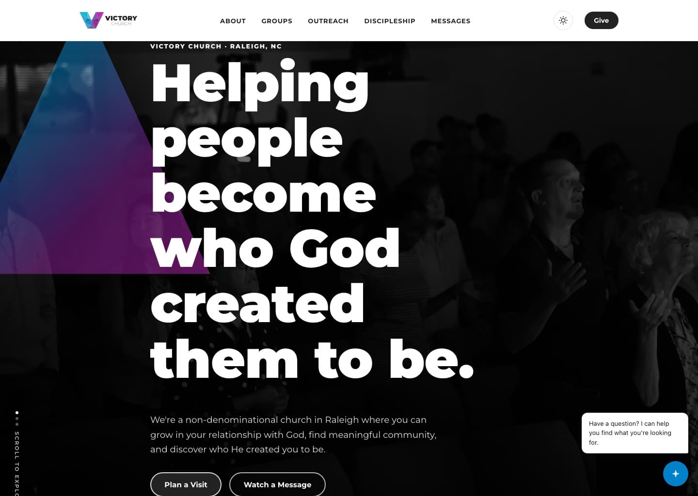
Victory Church
A custom website and brand system for a non-denominational church in Raleigh, designed to help first-time guests know exactly what to expect and take a confident next step.